
About
Situated in the lush, vibrant landscape of South Trinidad, Rancho Quemado Estates stands as a testament to nature’s abundance and community spirit. In 2007, Rancho Quemado established, Trinidad’s Natural, a brand that celebrates sustainability, heritage, and the dynamic essence of its surroundings through its distinctive chocolate wine. Rancho Quemado Estates combines traditional values with innovative practices to produce exceptional products. The estate is deeply committed to environmental stewardship and enhancing the local community. Through its dedication to quality and authenticity, Rancho Quemado Estates invites everyone to savor the unique harmony of nature’s finest, captured in their signature offerings.
The Challenge
Rancho Quemado Estates needed to refresh their brand to better reflect the essence of their signature chocolate wine and to expand public perception beyond their farming roots. The estate sought a comprehensive brand overhaul, including a logo refresh, color update, brand identity guide, brand messaging, and a thorough brand and marketing audit. Additionally, they aimed to transition into the product market, shifting from being known solely for farming to establishing a strong presence as a producer of innovative products. The objective was to create a cohesive and distinctive brand presence that communicated their values and distinguished them in a competitive market.

The Solution
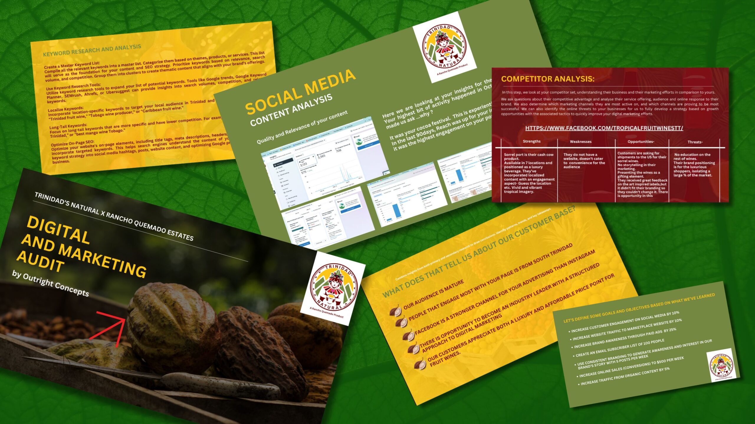
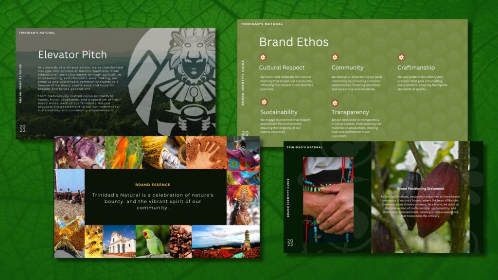
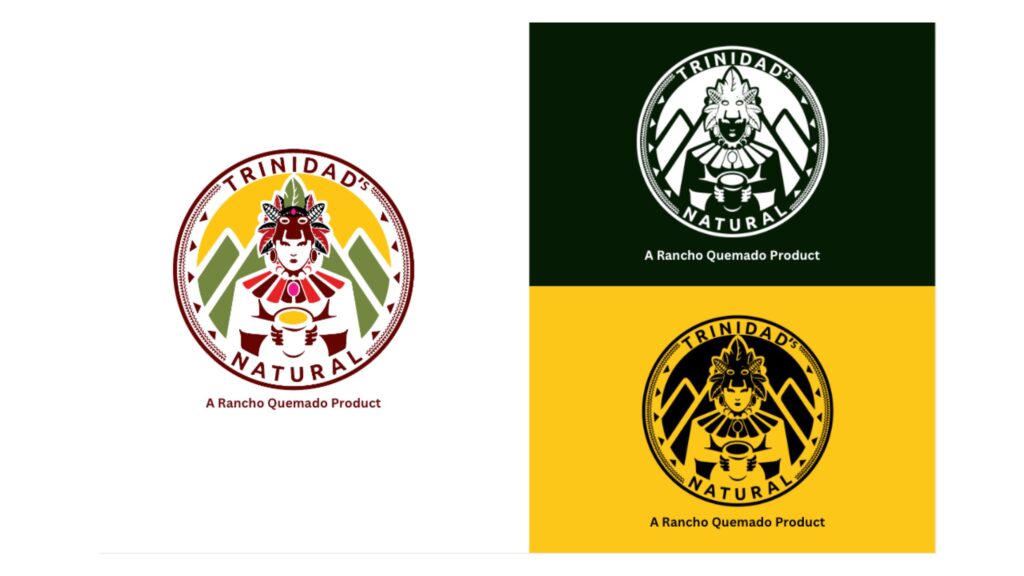
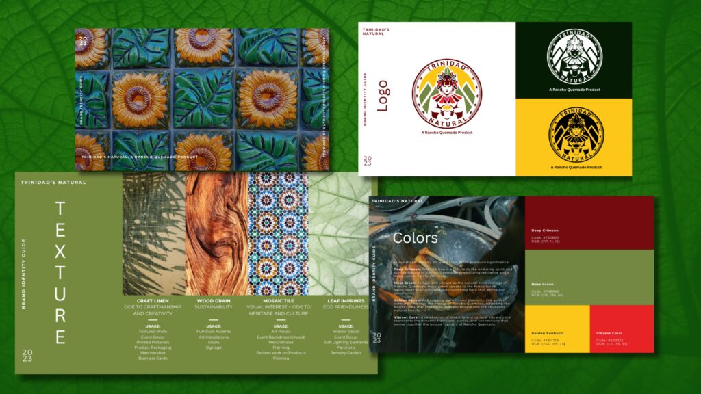
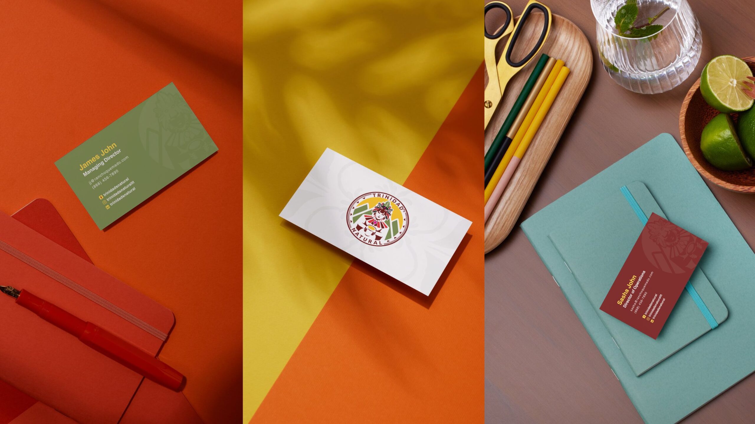
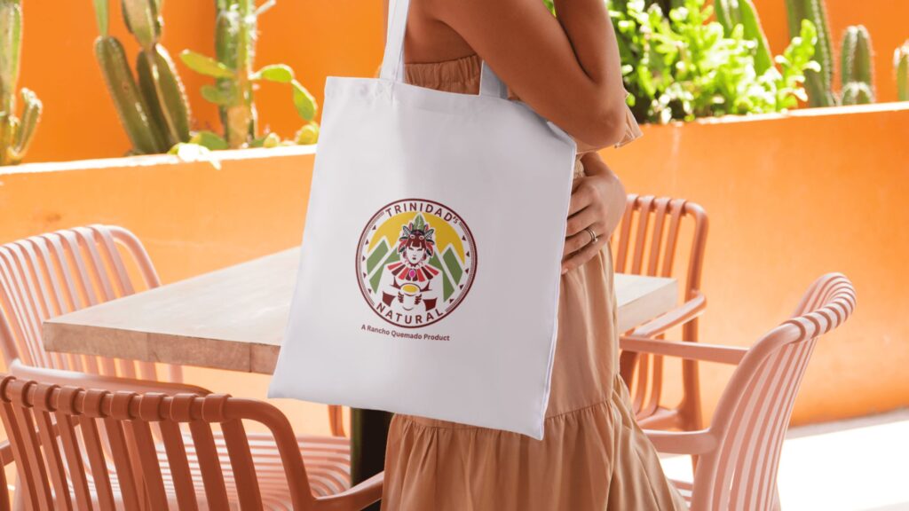
We began by conducting a thorough brand and marketing audit to understand the current landscape and identify opportunities for enhancement. Based on our findings, we executed a comprehensive brand refresh that included a new logo design, an updated color palette, and a detailed brand identity guide. We developed a brand messaging strategy that aligned with Rancho Quemado’s commitment to nature, sustainability, and community, ensuring that all communications were consistent and impactful. Our marketing analysis provided insights to refine their approach and amplify their presence in the market.

The Results
Revitalized Brand Presence: The refreshed logo and updated color palette successfully captured the vibrant and sustainable essence of Rancho Quemado Estates,
Cohesive Brand Messaging: The new brand messaging effectively communicated Rancho Quemado’s values and the unique qualities of their chocolate wine.
Enhanced Market Visibility: The brand and marketing audit, combined with strategic recommendations, improved Rancho Quemado’s visibility and helped them stand out as a pioneering force.
Strengthened Brand Consistency: The brand identity guide ensured consistent application across all touchpoints, reinforcing the brand’s presence and fostering a stronger connection with consumers